Tuesday, December 10, 2013
Volusion Changes, Our Latest Web Design Projects. 3DCart, Shopify & Big Commerce in the Future

2013 has been a busy and difficult year for me personally and at the Studio. My mother lost her battle with cancer in January, and I am still dealing with that. Since my own illness I have rebuilt the Studio and we have been busier than ever. Partly do to the major changes at Volusion. So I decided to show you what we at the studio have been doing and what we will be doing in the future.

The designs we have done this year with Volusion have been great experiences. Not only has the the Studio family grown with new clients but many of our existing clients have come back for redesigns and updates. Throught these project we can now offer our clients shopping cart customization that have proven to increase conversion up to 30%! As well as  product page costomizations that element that default standard look to your Volusion product page.

Not only is the Studio doing big things with Volusion stores but we have also moved to other E-copmmerce solutions. We recently completed a 3dCart project and have another one starting soon. We have also been approached by Shopify and BigCommerce to join there Design Providers.

This new redesign ramps up the cool freeze ans slick computer look


This client asked the Studio to take or original design and move it over the edge.

Another return client that gave us free rane with this new design


We redesign the site and took it old school baseball

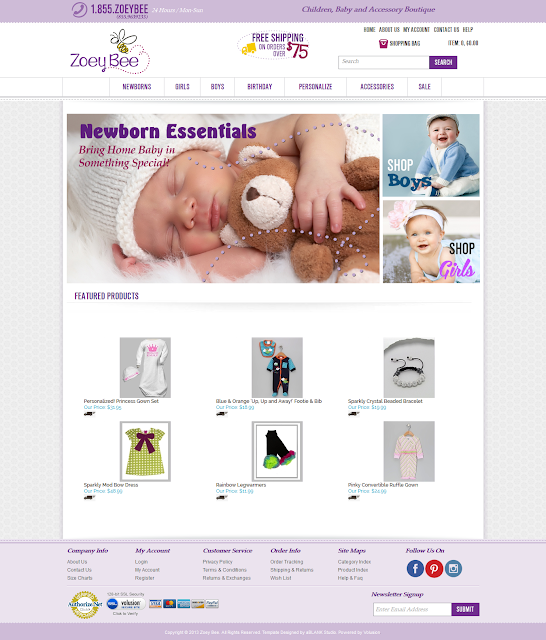
There is an interseting story with this project. Let just say that is a valid update of my earlier work.


Great client who has come back routinely for minor updates but the one is a major overhaul. We are still deciding on the new homepage which should be up before the new year
All of these next projects are new clients and  we really enjoyed working with them and hope to work with them in the future.

This client had purchased the below template but did not have a logo or even a name for there business. We where able to help them come up with a name for the business and this logo


Client purchased template from Volusion. but need us to complete the project. so we design the elegant interactive hompage design as well as buttons and heading graphics.


We were hired to finish this project, when the original failed to deliver the full mandate. This project started our journey into more developed customization of Volusion sites.


Wednesday, January 09, 2013
Authorized Volusion Partner


We at the Studio are extremely excited to announce were are now a Authorized Volusion Partner

This now allows us to provide discounts to our referred clients as be a reseller  at a reduced cost. Thousands of businesses trust Volusion's ecommerce solution to build and grow their online success. Experience the Volusion difference with award winning ecommerce software today.

Contact Issue Apoligy

I want to apologies to all my clients who have been struggling to contact recently over the last few months. I noticed a decline in emails and thought it was due to the holiday season. Until I realized I had not received any email in a few days! So I sent a email to myself and... nothing. Well I have been in talks with the two relevant companies involved and so far they blame each other. Which still doesn't get me emails.

If you are looking to contact me here at aBLANK Studio please email me at, ablank-studio@q.com

Monday, May 07, 2012
Mother's Day Sale at the Studio

We are offering 20% off our Volusion Template Package. A $240 savings! Contact us

Thursday, December 08, 2011

I was watching tv and flipped to the Judge Alex Show with a case already in progress. The case seem to be was between some kind of print company and a designer. The designer owed the company money but had a separate deal to create some logos for a group school sports teams. The designer point was that he didn't owe them money because he hadn't been paid for the 30 logos at $140 each. The company said they would never pay that much for logos especially when they could get the logos for FREE by searching for the artwork online. And that the logo banner only sell for $75 each. They then admitted to using around 8 of the logos.

The judge sided with the company since the designer  admitted to owing them money but didn't have a written contract about the logos. This really upset me because the judge totally ignored copyright law. If the designer didn't have written contract on the price of each logo, the company also didn't have written waver of the designers copyrights. They admitted to using several of the logos and to have the others that they could use at any time.

I say to the designer get proof of the logos they used sue their buts for copyright infringement. Taking a percentage of their profits from said sales.  Am I wrong to be angry? We designers have to look out for each other.

I believe this was, Season 7 Episode 48

Labels:

Wednesday, August 24, 2011
Volusion Changes

If you haven't already noticed, Volusion is making some changes. Exciting I know. One of these changes was to the product page. A page that is long over due for some upgrading if you ask me. The recent history section has had some changes, some good some not so good. One change is including product thumbnails, this was a great upgrade. But the another change was the placement of history off/on buttons. The new position next to the heading graphic can potentially cause some alignment issues for existing stores. If your heading graphic is too long then it will push content out of the frame. Causing your backhround graphic to repeat. When this issue was brought to "V's" attention. They decided that they were not going switch the buttons position back to the bottom. So check your product pages for anymore changes and for wonky alignment. There might be a new heading graphic in your future.

Monday, August 22, 2011
Blah Banners

Is your storefronts homepage looking a little hohum? And your wanting to livin it up with some new banners? Consider using icons to add some interest. Icons can come in large formats of 254x254 pixels, and be quality mini illustrstions. Perfect for the adverage size banner. The best part is many of these icons are FREE! So check out an icon factory the next time you have sale banner to be made.

Sunday, August 21, 2011
Keep It Simple Stupid...KISS!

As I sit here working on remodeling a site I did awhile ago, I am reminded of K.I.S.S. Sometimes simple and clean is the best way to go. Leave all the tricks and hype behind and create a clean design. One that speaks for itself and to the viewers. Well back to the drawing board and remember to KISS the designer.